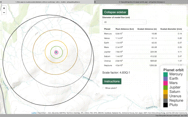
When I was in primary school I remember going into the playground to do a fun thought experiment to try and teach us just how vast the Solar System is, how much space there is between the planets, and how tiny the planets are compared to the Sun. We got a football to represent the Sun and measured the diameter. The teacher then did some maths to calculate how far away the planets would be if the Sun was the size of the football. The teacher then got us to lay out a long tape measure, and stand at distances along the tape measure to represent the planets. One child would be Jupiter, another child would be Saturn and get to hold a hula hoop to represent the rings.
I was talking with a friend who now works in science communication about this and I started to think about a place for a web-app that lets you define the size of your Sun model and then displays on a map the correctly scaled full orbits of the planets. You could say to your audience “if the Sun was 30 cm diameter, Neptune would be in the next town over”.
I only know how to make web apps in R Shiny, so I made one, and published it here .
The most interesting parts of this from a programming point of view were (a) learning how to define ellipses mathematically, using their major axis, minor axis, and eccentricity, and (b) transforming the coordinate systems between the appropriate UTM zone and Latitude/Longitude measurements for display on the map. I also learned a lot about reactive values in Shiny in the process. In particular, I learned a lot of terminology to describe the geometry of the planetary orbits, for example:
- Longitude of perihelion/periapsis - Angular direction of major axis of orbit if the inclination equalled the reference plane
- Argument of perihelion/periapsis - The vertical angle of the major axis from the reference plane
- Orbital eccentricity
- Longitude of ascending node
