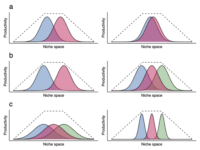
I’ve just finished writing the background chapter for my PhD thesis. I’ve been writing about how competing species co-exist by occupying different niche space. To visualise nice complementarity, I made these schematic diagrams, which I’ve included below along with the length caption I included in the chapter.

Schematic diagrams demonstrating niche occupation and secondary controls on the mechanism of niche complementarity. Each density plot shows a number of species, each represented by the species functional contribution (productivity) under different environmental conditions (niche space) within the larger environmental niche volume (dashed line). a) shows how the degree of overlap in functional niche of two species affects the total utilisation of the environmental niche volume (area under all species curves). When species are functionally distinct (left), more of the environmental niche volume is utilised. Removal of a species in this case would result in a large reduction in ecosystem productivity, while on the right, where functional redundancy is high, removal of a single species would have negligible effects. b) shows the effect of adding a functionally distinct species to an ecosystem. c) shows the effect of niche breadth on niche volume utilisation. On the left, three generalist species overlap in their functional niche. While each species has relatively incomplete utilisation of the environmental niche volume, this is offset as each species may occupy a wide range of environmental conditions. If the red species was removed, there would be only a marginal reduction in ecosystem productivity. On the right, three specialist species have a narrower niche breadth but a more complete utilisation of the environmental niche under ideal conditions. If a species was removed from this ecosystem, there would be a much greater reduction in ecosystem productivity.