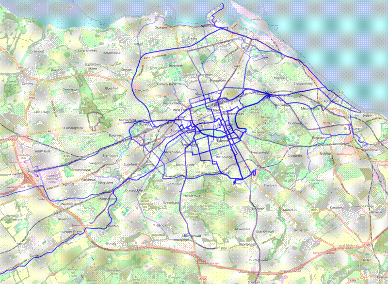
I have been using The Fitotrack Android app for a over a year now to track my bike rides. Fitotrack allows you to export the tracking data in XML format. I wrote an R script to process the XML data and create some basic summary plots. I have broken down the R script below:
Firstly, load necessary packages and import the compressed XML file, which has the file extension .ftb. I use Syncthing
to sync the backup files from my phone to my laptop.
# Process data from FitoTrack Android app
# John L. Godlee (johngodlee@gmail.com)
# Last updated: 2024-06-19

# Packages
library(dplyr)
library(XML)
library(lubridate)
library(ggplot2)
library(patchwork)
library(archive)
library(leaflet)
library(sf)

# Find all fitotrack backups
f <- list.files("~/syncthing/fitotrack", "*.ftb", full.names = TRUE)

# Check files found
stopifnot(length(f) > 0)
Then parse the file and extract each ride, represented by child nodes in the workouts part of the XML.
# 7z unarchive the file
conn <- archive_read(sort(f)[1])

# Import data
dat <- xmlParse(readLines(conn))

# Separate nodes with summary data
summ_nodes <- getNodeSet(dat, "//workouts//workouts")
Summarise each node and create a pretty dataframe, where each row is a ride.
# For each node, get children as list
summ_df <- bind_rows(lapply(seq_len(xmlSize(summ_nodes)), function(x) {
  as.list(getChildrenStrings(summ_nodes[[x]]))
})) %>%
  mutate(
    across(all_of(c("calorie", "ascent", "descent",
          "avgPace", "avgSpeed", "topSpeed",
          "length", "maxElevationMSL", "minElevationMSL")), as.numeric),
    start = as_datetime(as.numeric(start) / 1000),
    end = as_datetime(as.numeric(end) / 1000),
    duration = round(as.period(end - start)),
    pauseDuration = round(seconds_to_period(as.numeric(pauseDuration) / 1000)))
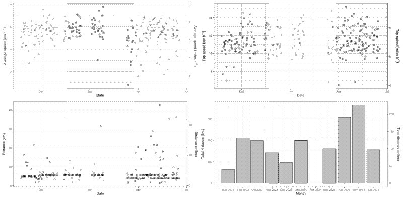
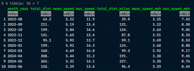
Create plots with summary information for each ride (plots_all), and a table with the same information (month_summ).
# Define conversion factor km to miles
kmt <- 0.6213711922

# Plot average speed of all rides over time
avgSpeed_ts <- ggplot(summ_df, aes(x = start, y = avgSpeed)) +
  geom_point(shape = 21) +
  theme_bw() +
  scale_y_continuous(
    name = expression("Average speed"~(km~h^-1)),
    sec.axis = sec_axis(
      transform = ~.*kmt, name = expression("Average speed"~(miles~h^-1)) )) +
  xlab("Date")

# Plot top speed of all rides over time
topSpeed_ts <- ggplot(summ_df, aes(x = start, y = topSpeed)) +
  geom_point(shape = 21) +
  theme_bw() +
  scale_y_continuous(
    name = expression("Top speed"~(km~h^-1)),
    sec.axis = sec_axis(
      transform = ~.*kmt, name = expression("Top speed"~(miles~h^-1)) )) +
  xlab("Date")

# Plot length of all rides over time
length_ts <- summ_df %>%
  mutate(length_km = length / 1000) %>%
  ggplot(., aes(x = start, y = length_km)) +
    geom_point(shape = 21) +
    theme_bw() +
    scale_y_continuous(
      name = "Distance (km)",
      sec.axis = sec_axis(
        transform = ~.*kmt, name = "Distance (miles)")) +
    xlab("Date")

# Monthly breakdown of:
# total distance
# average speed
# top speed
month_summ <- summ_df %>%
  mutate(month_year = format(as.Date(start), "%Y-%m")) %>%
  group_by(month_year) %>%
  summarise(
    total_dist = sum(length, na.rm = TRUE) / 1000,
    mean_speed = mean(avgSpeed, na.rm = TRUE),
    max_speed = max(topSpeed, na.rm = TRUE)) %>%
  mutate(
    total_dist_miles = total_dist * kmt,
    mean_speed_mph = mean_speed * kmt,
    max_speed_mph = max_speed * kmt)

# Plot monthly total distance bar chart
month_dist <- month_summ %>%
  mutate(month_year_date = as.Date(paste0(month_year, "-01"))) %>%
  ggplot(., aes(x = month_year_date, y = total_dist)) +
    geom_bar(stat = "identity", colour = "black", fill = "grey") +
    theme_bw() +
    scale_x_date(
      breaks = seq(
        as.Date(paste0(min(month_summ$month_year), "-01")),
        as.Date(paste0(max(month_summ$month_year), "-01")),
        by = "month"),
      date_labels = "%b %Y") +
    scale_y_continuous(
      name = "Total distance (km)",
      sec.axis = sec_axis(
        transform = ~.*kmt, name = "Total distance (miles)")) +
    xlab("Month")

# Patchwork plots together
plots_all <- avgSpeed_ts + topSpeed_ts + length_ts + month_dist
Now to process the data from a single ride. Fitotrack splits each ride up into interals which share a single ID, within the samples part of the XML.
First process each node and create a pretty dataframe.
# Get intervals
# Separate nodes
int_nodes <- getNodeSet(dat, "//samples//samples")

# For each node, get children as list
int_list <- lapply(seq_len(xmlSize(int_nodes)), function(x) {
  as.list(getChildrenStrings(int_nodes[[x]]))
})

# Process intervals
# summ_list$samples[[1]]
int_df <- bind_rows(lapply(int_list, function(x) {
  data.frame(
    "int_id" = x$id,
    "id" = x$workoutId,
    "elevation" = as.numeric(x$elevation),
    "latitude" = as.numeric(x$lat),
    "longitude" = as.numeric(x$lon),
    "speed" = as.numeric(x$speed))
  })) %>%
  group_by(id) %>%
  arrange(int_id) %>%
  mutate(int = row_number()) %>%
  relocate(id, int) %>%
  dplyr::select(-int_id) %>%
  mutate(per = int / max(int))

# Check all interval IDs in summary dataframe
stopifnot(all(sort(unique(int_df$id)) %in% sort(unique(summ_df$id))))
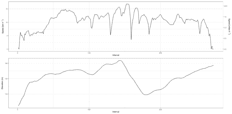
Then extract a single ride ID, in this case the most recent ride, and create interval plots. The first is a speed plot, and the second is an elevation plot.
# Extract most recent ID
ex_id <- summ_df$id[order(summ_df$start, decreasing = TRUE)][1]

# Create speed plot of a particular ride
int_speed <- int_df %>%
  filter(id == ex_id) %>%
  ggplot(., aes(x = int, y = speed)) +
    geom_line() +
    theme_bw() +
    scale_y_continuous(
      name = expression("Speed"~(km~h^-1)),
      sec.axis = sec_axis(
        transform = ~.*kmt, name = expression("Speed"~(miles~h^-1)) )) +
    xlab("Interval")

# Create elevation plot of a particular ride
int_elev <- int_df %>%
  filter(id == ex_id) %>%
  ggplot(., aes(x = int, y = elevation)) +
    geom_line() +
    theme_bw() +
    labs(
      x = "Interval",
      y = "Elevation (m)")

# Combine speed and elevation plots for a particular ride
plots_ride <- (int_speed + int_elev) +
  plot_layout(ncol = 1)
Finally, create a simple interactive map of the ride.
# Create sf object with interval points
int_sf <- int_fil %>%
  st_as_sf(., coords = c("longitude", "latitude"), crs = 4326)

# Duplicate points to get start and end of interval,
# add ID, summarise to interval lines
int_lines <- int_sf %>%
  mutate(int = int - 1) %>%
  bind_rows(., int_sf) %>%
  arrange(int) %>%
  group_by(int) %>%
  summarise(
    elevation = mean(elevation),
    speed = mean(speed),
    per = mean(per),
    n = n(),
    do_union = FALSE) %>%
  filter(n > 1) %>%
  st_cast(., "LINESTRING")

# Create colour palette
pal <- colorNumeric(palette = "plasma", domain = int_lines$speed)

# Create leaflet map call
lmap <- leaflet() %>%
  addTiles() %>%
  setView(
    lng = mean(int_fil$longitude),
    lat = mean(int_fil$latitude),
    zoom = 12) %>%
  addPolylines(
    data = int_lines,
    color = pal(int_lines$speed),
    opacity = 1)
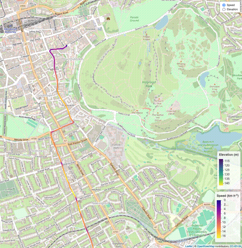
Update 2024-07-02
I recently added a kind of heatmap that plots all my rides using leaflet. It uses the leafgl package to efficiently render many line segments using webGL. For ~140,000 line segments it took about 5 seconds to load the map and the map is pretty snappy in the browser once it is rendered.
int_all_sf <- int_all %>%
  st_as_sf(., coords = c("longitude", "latitude"), crs = 4326)

# Duplicate points to get start and end of interval,
# add ID, summarise to interval lines
int_all_lines <- int_all_sf %>%
  mutate(int = int - 1) %>%
  bind_rows(., int_all_sf) %>%
  arrange(int) %>%
  group_by(id, int) %>%
  summarise(
    elevation = mean(elevation),
    speed = mean(speed * 1/kmt),
    per = mean(per),
    n = n(),
    do_union = FALSE,
    .groups = "keep") %>%
  filter(n > 1) %>%
  st_cast(., "LINESTRING")

# Create leaflet heatmap of all rides
heatmap_all <- leaflet(options = leafletOptions(perferCanvas = TRUE)) %>%
  addTiles() %>%
  setView(
    lng = mean(int_all$longitude),
    lat = mean(int_all$latitude),
    zoom = 12) %>%
  addGlPolylines(
    data = int_all_lines,
    color = "#0000ff",
    opacity = 0.05,
    src = TRUE,
    digits = 5)
