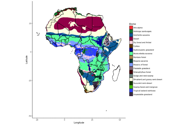
As I’ll soon be embarking on my PhD research into biodiversity and woodland productivity in Southern Africa, I thought I should get a better idea of how the vegatation differs across the continent.
I normally try to use R instead of point and click GIS packages like ArcMap or QGIS, so all the code here is to be used in an R session.
The packages I used are:
library(maps)
library(rgdal)
library(ggplot2)
library(ggmap)
First I needed a base map of Africa, ideally with countries on, which I found here .
# Import shapefile of country borders ----
countries <- readOGR(dsn="africa",
                     layer="Africa")
countries@data

countries_fort <- fortify(countries, region = "COUNTRY")

# Plot country borders ----
ggplot() +
	geom_polygon(aes(x = long, y = lat, group = group, fill = NA),
							 colour = "black",
							 data = countries_fort) +
	theme_classic()  +
	scale_fill_manual(values = palette_veg_type_19) +
	labs(fill = "Biome") +
	xlab("Longitude") +
	ylab("Latitude") +
	coord_map()
To investigate vegetation types I tracked down a shapefile version of White’s 1983 Vegetation Map . The map is the result of 15 years of work by UNESCO and AEFTET and was created by first compiling many existing maps, then cross-checking with extensive fieldwork and consultation with local experts.

To create the map above I used the ggplot2 and rgdal packages:
# Read shapefile ----
white_veg <- readOGR(dsn="whitesveg",
                     layer="Whites vegetation")

# Explore shapefile
white_veg@data
white_veg@bbox
white_veg@proj4string

# Fortify shapefile for use in ggplot2 ----
white_veg_fort <- fortify(white_veg, region = "DESCRIPTIO")
names(white_veg_fort)
length(unique(white_veg_fort$id))

# Create colour palette for ggplot2 ----
palette_veg_type_19 <- c("#FF4A46","#008941","#006FA6","#A30059","#FFDBE5",
                         "#7A4900","#0000A6","#63FFAC","#B79762","#004D43",
                         "#8FB0FF","#997D87","#5A0007","#809693","#FEFFE6",
                         "#1B4400","#4FC601","#3B5DFF","#4A3B53")

# ggplot Africa with vegetation ----
ggplot() +
  geom_polygon(aes(x = long, y = lat, group = group, fill = id),
               data = white_veg_fort) +
  geom_polygon(aes(x = long, y = lat, group = group, fill = NA),
               colour = "black",
               data = countries_fort) +
  theme_classic()  +
  scale_fill_manual(values = palette_veg_type_19) +
  labs(fill = "Biome") +
  xlab("Longitude") +
  ylab("Latitude") +
  coord_map()
To look specifically at Southern Africa I had to use some trial and error to get the x and y limits right in the ggplot() call:
# ggplot Southern Africa ----
ggplot() +
  geom_polygon(aes(x = long, y = lat, group = group, fill = id),
               data = white_veg_fort) +
  geom_polygon(aes(x = long, y = lat, group = group, fill = NA),
               colour = "black",
               data = countries_fort) +
  theme_classic()  +
  scale_fill_manual(values = palette_veg_type_19) +
  labs(fill = "Biome") +
  xlab("Longitude") +
  ylab("Latitude") +
  coord_map(xlim = c(10, 40), ylim = c(-35, -10))
The steps once again for anyone interested in a mapping workflow in R:
- Import shapefile with
readOGR() - Explore shapefile
- “Fortify” shapefile for use in
ggplot() - Plot using
ggplot()
I also wrote a tutorial for the Coding Club group I’m involved with on using R as a GIS