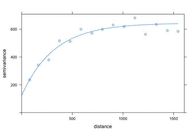
The default output of variogram() from the {gstat} package looks fine:

But I wanted more control over how it looked for a manuscript I’m writing. I’m most familiar with {ggplot2} so wanted to use that.
First grab some data
library(gstat)
dat <- meuse

df <- data.frame(x = dat$x, y = dat$y, copper = dat$copper)
Create a semivariogram and line fit:
semivar <- variogram(copper~1, data = df, locations = ~x+y)

semivar_fit <- fit.variogram(semivar,
  model = vgm(psill = 600, model = "Exp", range = 500, nugget = 200))

plot(semivar, semivar_fit)
The plot function produces the same plot as seen above.
Now to grab values from semivar and semivar_fit for ggplot2:
semivar_fit_fort <- variogramLine(semivar_fit, maxdist = max(semivar$dist))
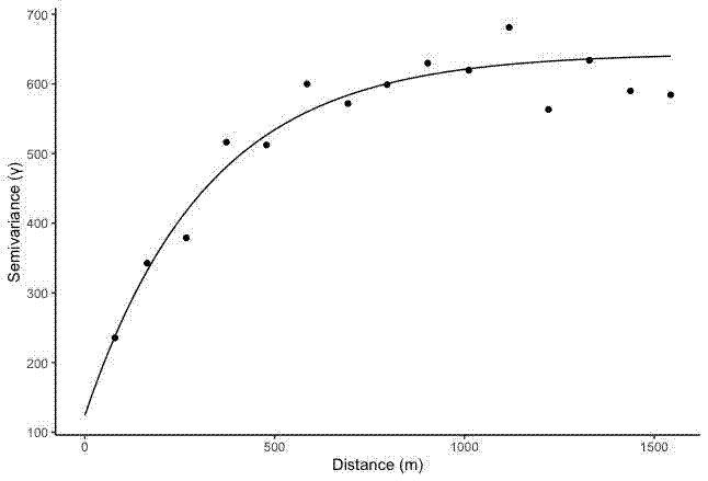
And then plot the relevant columns from semivar and semivar_fit_fort in ggplot():
ggplot() +
  geom_point(data = semivar, aes(x = dist, y = gamma)) +
  geom_line(data = semivar_fit_fort, aes(x = dist, y = gamma)) +
  #ylim(0, 52) +
  theme_classic() +
  labs(x = "Distance (m)", y = "Semivariance (\u03B3)")
