For a paper I’ve been writing I was running linear mixed effects models with categorical fixed effects to compare the amount of pine weevil damage present in different forest sites. To evaluate my models, I wanted to run pairwise comparisons between sites in the model to see which sites were significantly different. I decided to run a Tukey’s HSD (Honestly Significant Difference) test on Estimated Marginal Means of sites in the model. I’m doing my analysis in R, so all the code is R code.
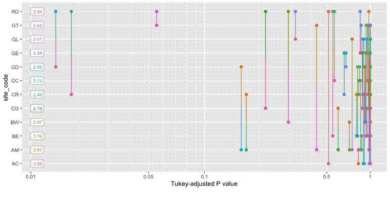
I used emmeans::emmeans() to calculate the EMMs, which returns a special object of class emmGrid. emmeans::pwpp() is a handy function to create and plot the results from a Tukey’s HSD (or other test method) pairwise comparison of the EMMs, with P-value along the x axis and categories along the y axis. Lines connect pairwise categories and are placed along the x axis to denote the significance of their difference.
The basic plot is fine, and is certainly useful for interpretation, but I want to include the plots in my paper and they look a bit too much like the ggplot() default. The plotting method also makes it difficult to customise the plot. The basic code to produce the plot is below:
# Packages
library(glmmTMB)
library(emmeans)
library(ggplot2)

# Import data
df <- read.csv("~/Desktop/pwpp_data.csv")

# Run mixed effects model
mod <- glmmTMB(mm2_damage ~ site_code + (1|family),
  data = df)

# Estimate Marginal Means
tukey <- emmeans(mod, "site_code")

# Run Pairwise compari
pwpp_results <- pwpp(tukey, values = TRUE, sort = FALSE)

# Look at basic plot
pwpp_results
The plot looks like this:

As the object pwpp_results is a glorified ggplot() object, it’s possible to extract the data used to make the plot and store it in tidy dataframes:
# Extract data from plot object
marg_vals <- data.frame(
  y = pwpp_results$layers[[3]]$data$site_code,
  label = pwpp_results$layers[[3]]$data$fmtval)

p_vals <- data.frame(
  x = pwpp_results$data$p.value,
  plus = pwpp_results$data$plus,
  minus = pwpp_results$data$minus,
  midpt = pwpp_results$data$midpt)
marg_vals holds data on the marginal values for each category, which appear as labels down the left hand side of the plot. p_vals contains data for drawing the lines.
I also wanted to create a colour palette for my customised plot, which I made here, at Colorgorical :
# Create colour palette
site_pal <- c("#270fe2", "#75ae0a", "#b427b7", "#14e54b",
  "#8e4380", "#0b5313", "#d992e2", "#7ba979",
  "#fc2c44", "#1ce0b2", "#900e08", "#37bad7")
I can then create the plot:
pwpp_ggplot <- ggplot() +
  geom_segment(data = p_vals,
    aes(x = x, xend = x, y = plus, yend = midpt, colour = minus)) +
  geom_point(data = p_vals,
    aes(x = x, y = plus, colour = minus),
    size = 3) +
  geom_label(data = marg_vals,
    aes(x = 0.01, y = y, label = label),
    label.padding = unit(0.15, "lines"), hjust = "right") +
  geom_vline(aes(xintercept = 0.05),
    linetype = 2) +
  ylab("Site") +
  xlab("Tukey-adjusted P value") +
  theme_classic() +
  theme(panel.grid.major.y = element_line(colour="#E0E0E0"),
    axis.title = element_text(size = 14),
    axis.text = element_text(size = 12),
    axis.text.y = element_text(colour = site_pal),
    legend.position = "none") +
  scale_x_continuous(breaks = c(0, 0.05, 0.1, 0.5, 1)) +
  scale_colour_manual(values = site_pal) +
  coord_trans(x = "log10", clip = "off")
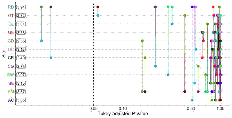
geom_segment draws the lines. Each line is actually composed of two line segments which meet at p_vals$midpt and are coloured according to the opposite point.
geom_label plots the marginal values, which are placed at x = 0.01 and are right aligned so they are unlikely to overlap a comparison line.
geom_vline denotes the p = 0.05 significance line.
panel.grid.major.y draws lines for each category, which helps when reading the graph and matching line ends with categories.
scale_x_continuous marks breaks for a number of common significance thresholds.
coord_trans log transforms the x axis so that lines near the low end of the P value scale are more spaced out, as they are more important for interpretation, clip = "off" ensures that the full range of P values is shown, so plots are interpretable across models with different categories.
The final plot looks like this:
